Can a wonky logo earn your trust? The psychology of naive design in branding
Ever painted a birthday banner and squeezed the last few letters into a centimetre, or covered your pencil case in tiny cartoon faces? You’ll recognise that homemade character in naive design in branding. Apparently, your stationery had creative direction.
With naive design in branding, a café’s mascot might be a smiling coffee bean in enormous trainers. Its proportions are exaggerated on purpose, with uneven strokes that suggest someone enjoyed drawing it. We’d absolutely order a cappuccino from that little guy!
AI can generate an equally lovable illustration, of course. So naive design in branding gets us talking about trust: what makes something appear drawn by a person, and how does seeing the artist’s sketches influence our response? We’d certainly like to meet whoever chose those trainers.
Keep reading – we’re looking at why these details can feel so personal and how your brand can use them to encourage customer trust.
Naive design in branding – what it means and where it comes from
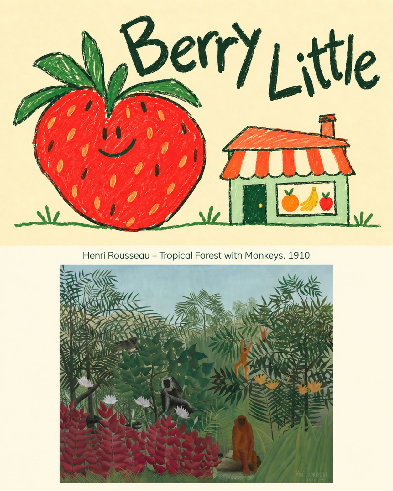
Naive design in branding deliberately recreates the simplicity of children’s drawings. You’ll often see flat illustrations and lettering with an uneven baseline, meaning the characters sit at slightly different heights. A strawberry might be bigger than the shop selling it. Designers carefully plan the layout so your eye finds the product name first and the practical information stays easy to read. There’s plenty of thought behind that casual appearance.
There’s art history here too. The aesthetic of naive design in branding takes inspiration from naïve art, associated with painters who taught themselves. Henri Rousseau, a former Paris toll collector, is a celebrated example. He used Paris’s botanical gardens and magazine imagery as references for his imaginary jungles. Pablo Picasso admired his work and organised a party in his honour in 1908. We’d have RSVP’d immediately – and enthusiastically requested a seat beside Henri.
How to recognise naive design in branding
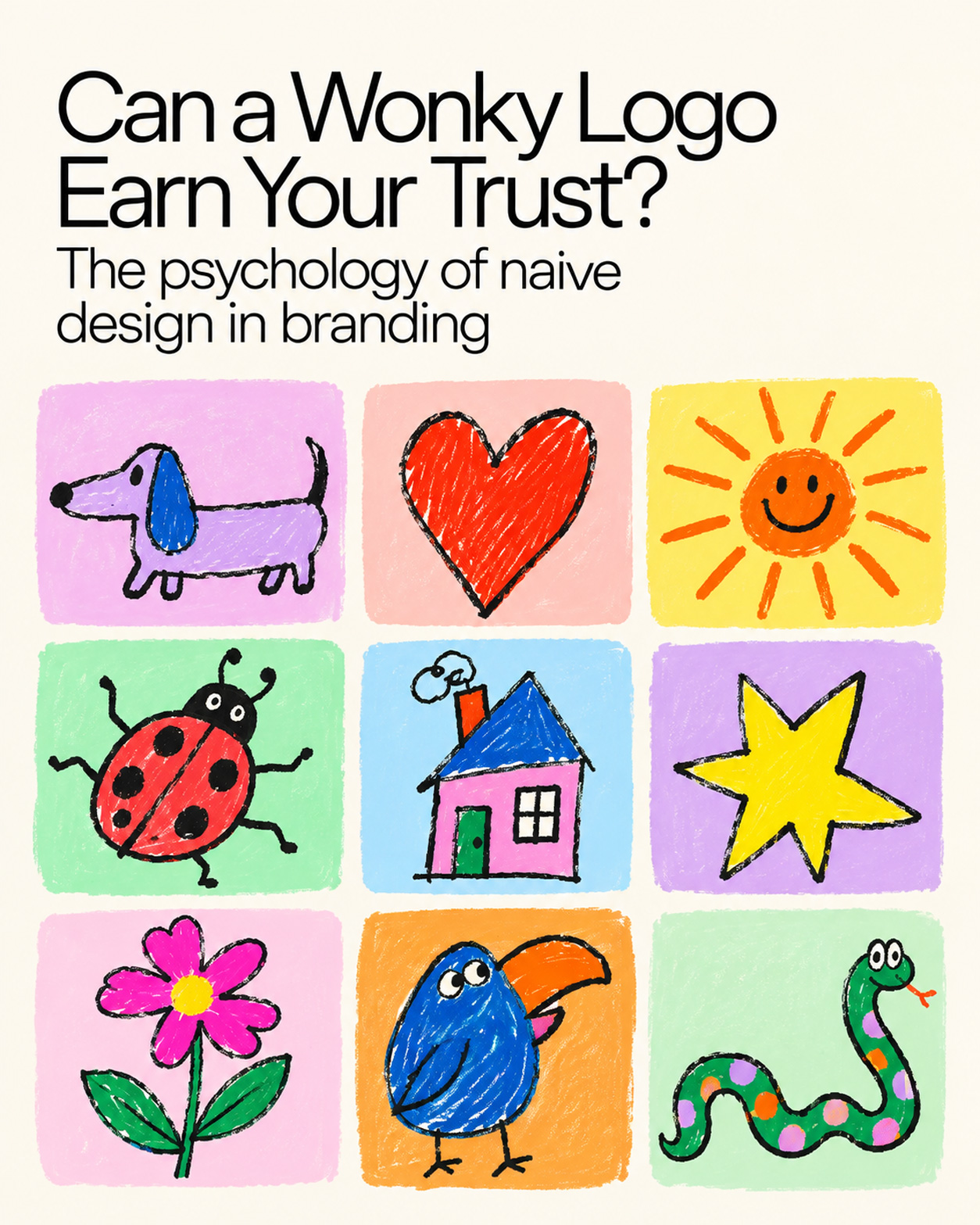
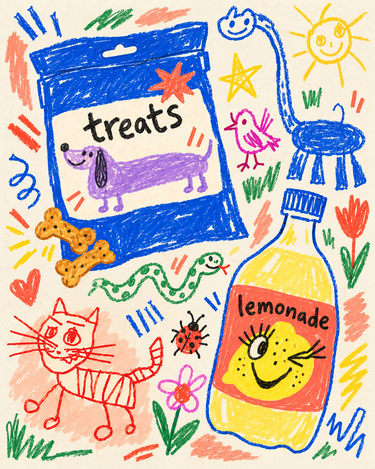
Okay, imagine a lilac dachshund grinning across a packet of dog treats. That welcoming expression illustrates the emotional impact naive design in branding aims to create. Intentional imperfection might appear in crayon grain or patches of pigment with varying density. Solid fills emphasise silhouettes, giving even a simple symbol a distinctive outline. Such details can suggest an individual maker’s attention. Somebody please give that purple pup a biscuit!
Contrast and clarity help people understand what’s on offer. When applying naive design in branding, combine expressive artwork with a straightforward typeface and generous white space. Yep, the price needs to be legible too. Strong differences between text and background help essential wording remain visible. Check how everything reproduces at smaller sizes, including a thumbnail on someone’s phone, so shoppers can enjoy the visual humour and quickly confirm what they’re buying.
At RED, we’d have some fun with naive design in branding, keeping the natural variations in freehand marks and letting selected letterforms tilt. A pairing like cobalt and coral adds exuberance, with each shape filled in a single shade. Keep the composition flat, using size and placement to direct attention. Little doodles or familiar facial expressions can add an approachable quality. A winking lemon on a lemonade label would get our approval – especially with outrageously long eyelashes.
Why naive design in branding is trending in 2026
Canva’s 2026 report recorded a 90% rise in searches for DIY and scrapbook elements on its platform compared with the previous year. For us, naive design in branding reflects that broader interest in individual expression. TBWA’s new identity, developed by DXD, includes brushwork and a monogram drawn by hand, then refined digitally. Yes, a global agency can enjoy a painting session. The same Canva report says 77% of surveyed creators regard AI as an essential partner.
Experiments published in the Journal of Consumer Research in 2018 found that fonts resembling handwriting could increase perceived human presence, encouraging emotional attachment and favourable product evaluations. Responses depended on positioning and customers’ existing relationships with brands. That offers one explanation for the appeal of naive design in branding: visual cues can suggest somebody’s involvement. Aha, we’re making social judgements from the appearance of a few letters! We’d choose a design style that matches what customers expect from your product.
With AI making immaculate imagery easier to produce, we see growing value in designs that invite a personal response. That’s part of the appeal of naive design in branding in 2026. There’s a language connection here, too: ‘aesthetic’ has roots in sensing and feeling, while ‘anaesthetic’ relates to suppressing sensation. For us, it’s a reminder to consider the emotion an image creates alongside its appearance. Give your audience something to enjoy.
Of course, generative tools can produce those endearing scribbles too. So with naive design in branding, we’d help customers see who’s behind the artwork: credit the creator and describe any AI involvement. A studio video can document how the concept developed. Go on, let the designer explain that extravagant little hat. Customers then have something concrete to assess – a named person’s decisions and a business that’s open about its process.
Where we’d use naive design in branding
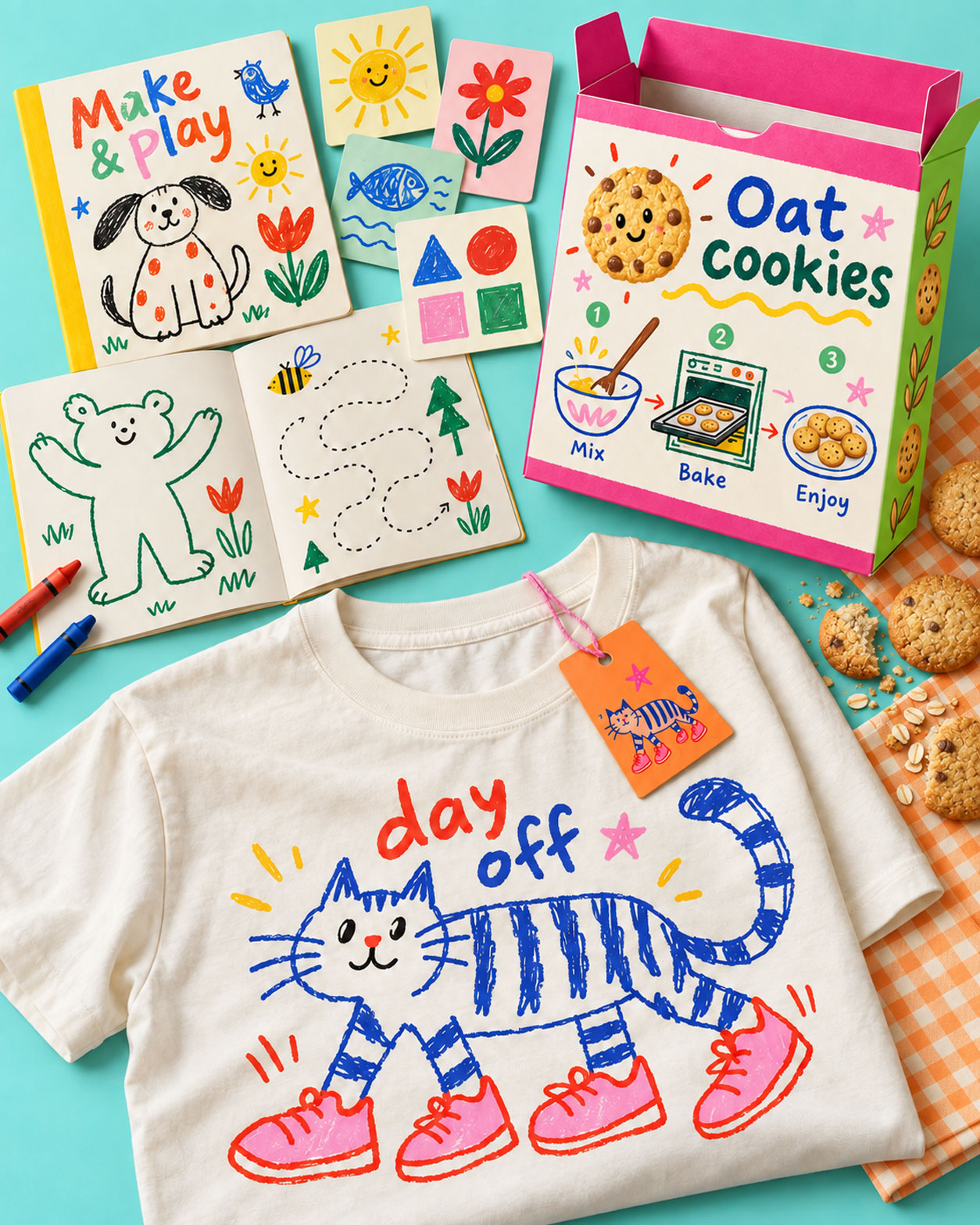
Children’s products and education are among our picks for naive design in branding. Those little art critics know what they like! Food and beverage businesses might feature a producer’s illustrated recipe on packaging, giving customers something useful to keep. Fashion and streetwear offer another opportunity through exclusive garment graphics or collectible tags.
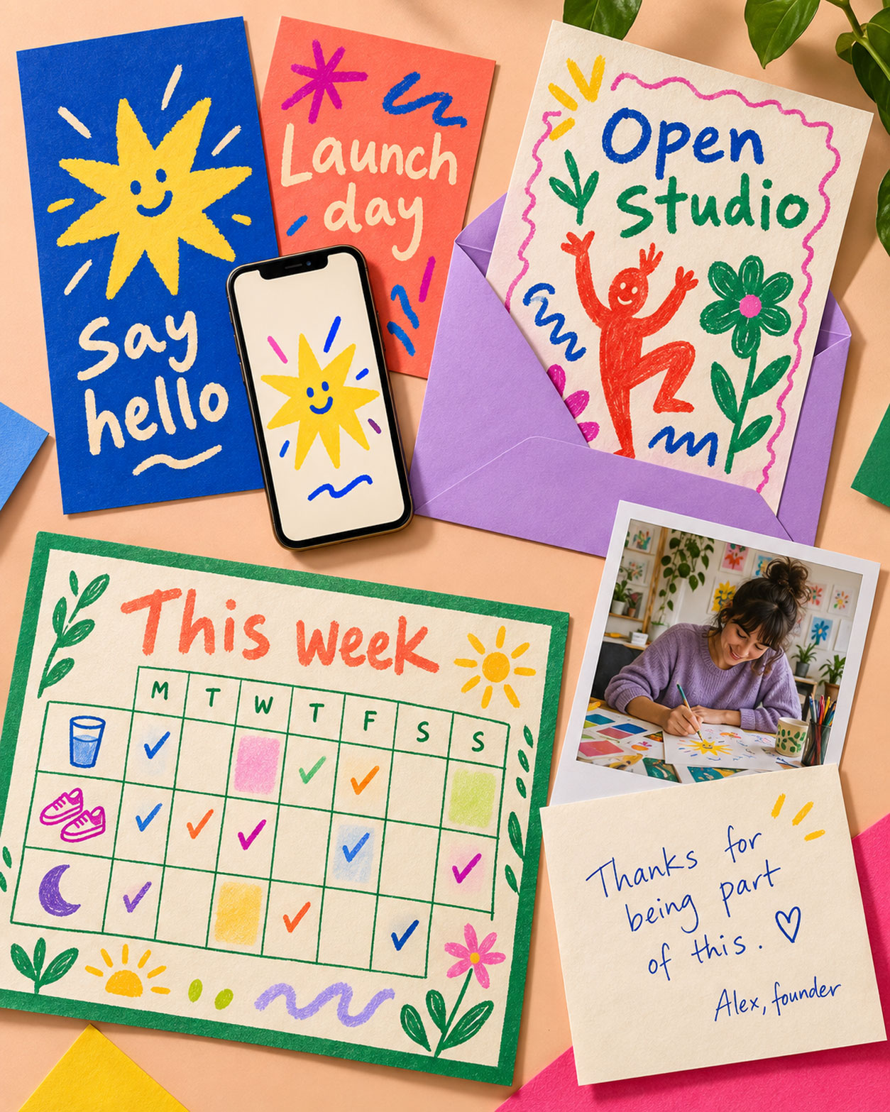
Creative agencies and startups have scope for naive design in branding in launch materials. We’d consider bespoke invitations for arts organisations, events and festivals, while illustrated habit trackers could suit health and wellness businesses. Start with one project, then assess the response. A founder’s handwritten message or an original studio photograph can add a personal detail with an identifiable source. Oh, and introduce the people who made the work – customers can get to know them too!
RED Marketing
78 York St, London W1H 1DP, United Kingdom
Phone: +44 7874 160 831
Web: https://www.redmarketing.biz
What should a UGC brief include?
A UGC brief should include the campaign objective, intended customer, core message, mandatory product information, content specifications, call to action, disclosure requirements and usage rights. It should also explain where the creator has freedom to use their own language and style.
Should brands provide UGC creators with scripts?
Scripts should generally be reserved for information that must be communicated exactly, such as regulated claims or legal wording. In other situations, talking points usually produce more natural content than word-for-word scripts.
How many benefits should a UGC video include?
Most short-form creator videos should concentrate on one principal problem or benefit. Additional messages can be tested through separate videos rather than compressed into one crowded piece of content.
Why does some UGC still feel like an advert?
UGC often feels like traditional advertising when it is overly scripted, excessively polished, heavily branded or disconnected from the creator’s normal way of speaking. The appearance may resemble organic content, but the delivery signals that it has been tightly controlled.